I focused on these product areas
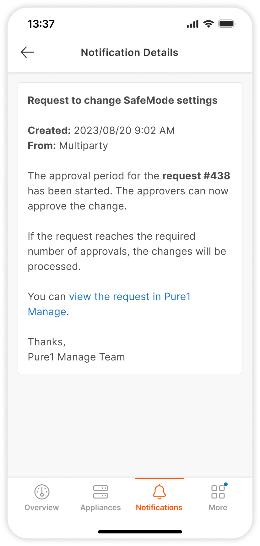
Enhanced SafeMode
Slow manual processes and limited automation led to delays (one month per change request) and undue reliance on the support team.
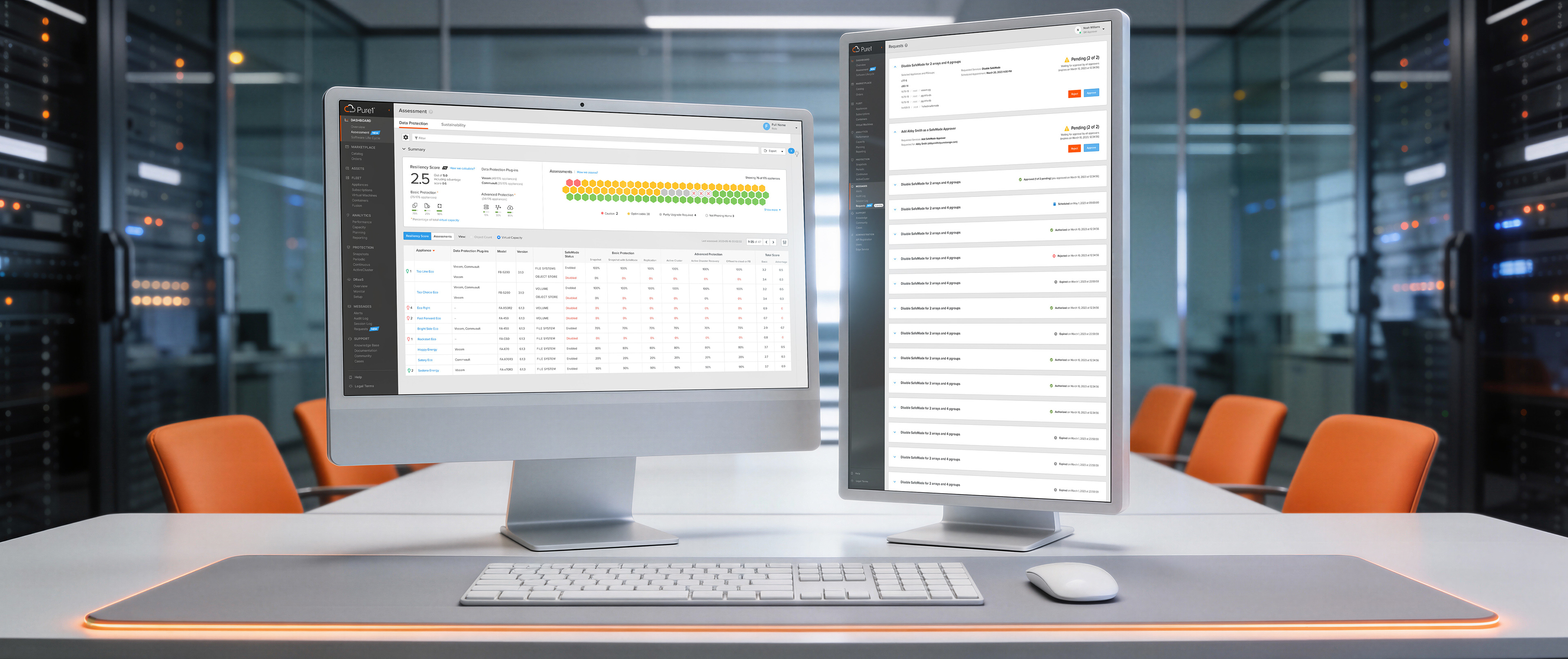
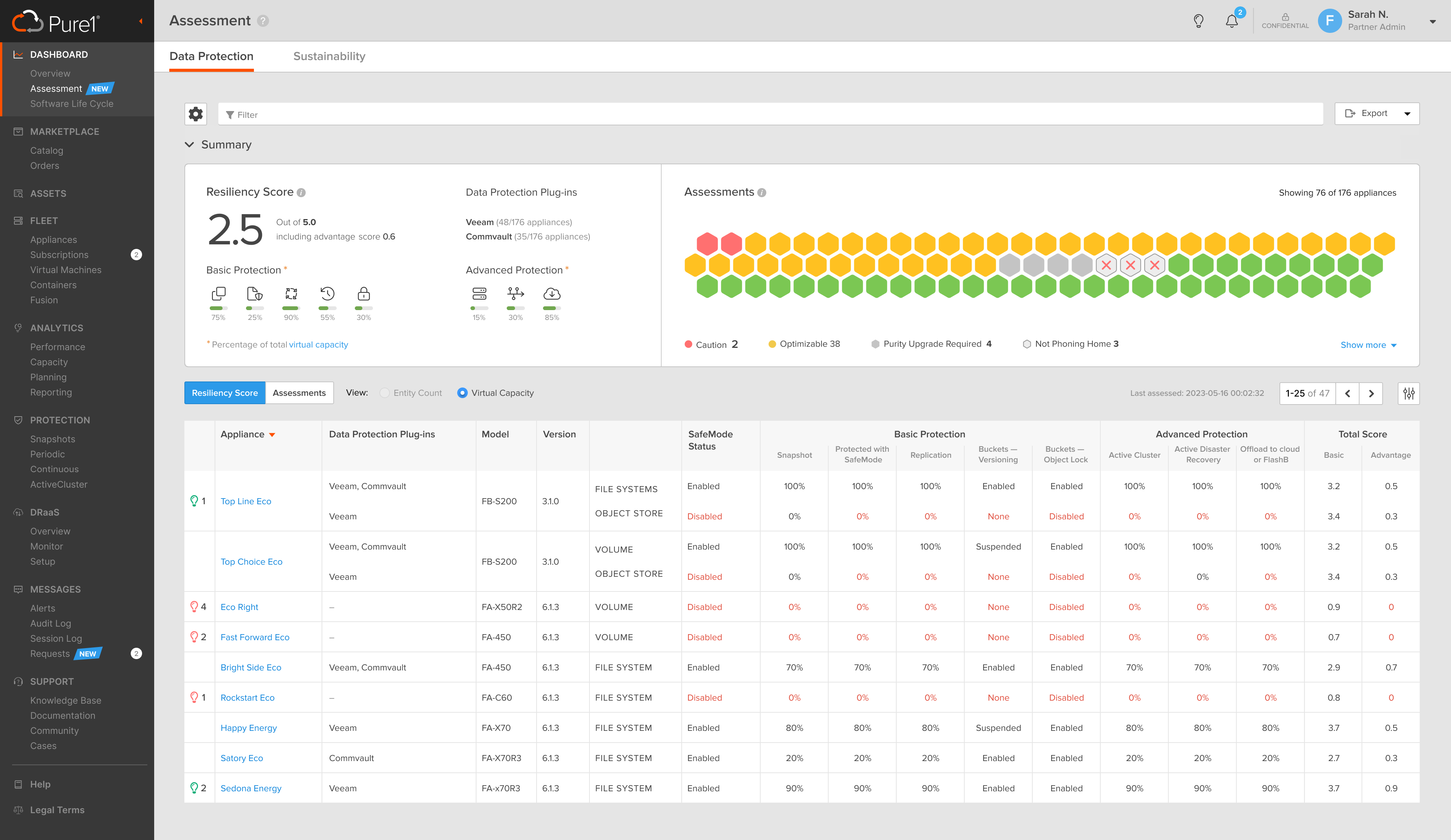
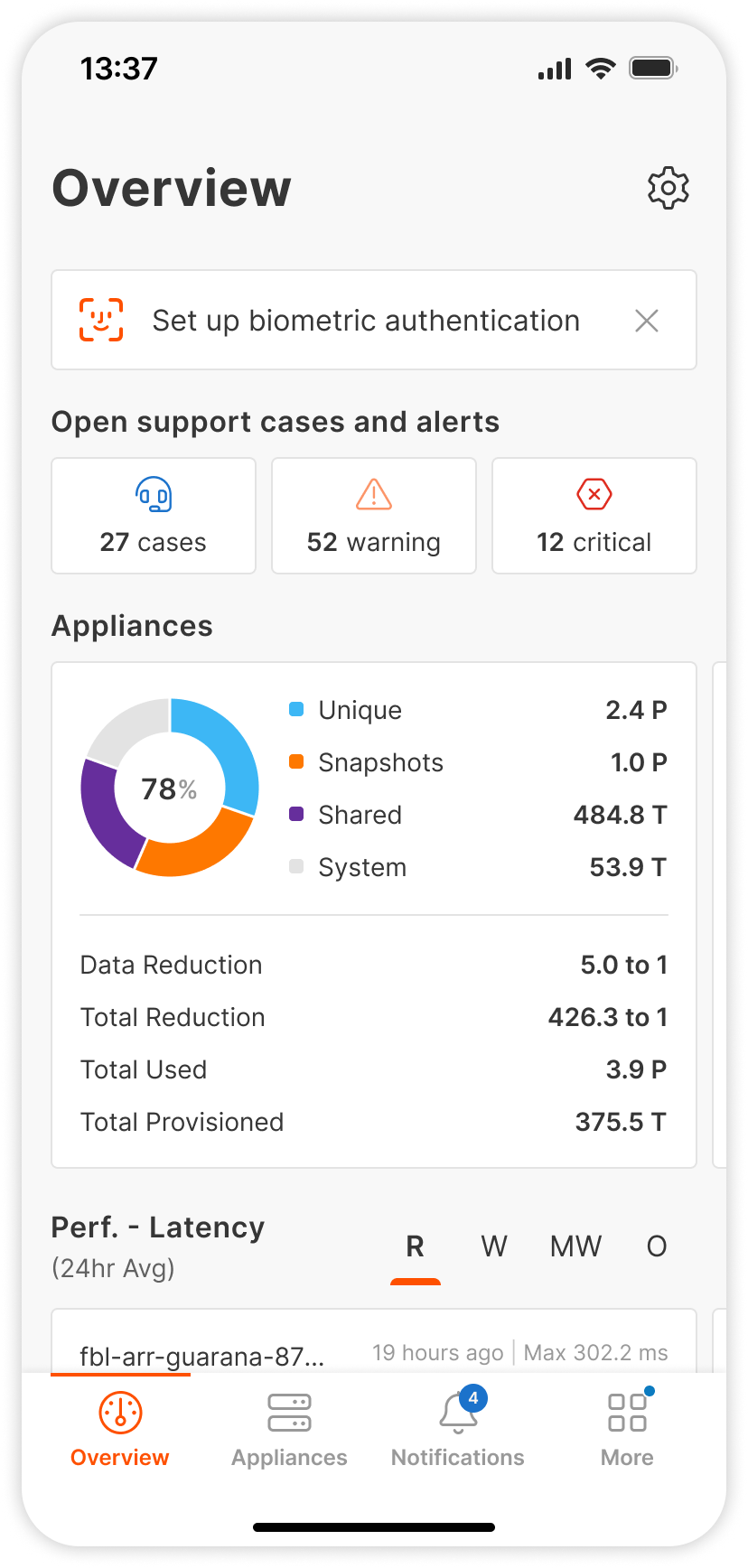
Data Resiliency Score Dashboard
There was no clarity on their data resilience state and explicit direction on where to improve.
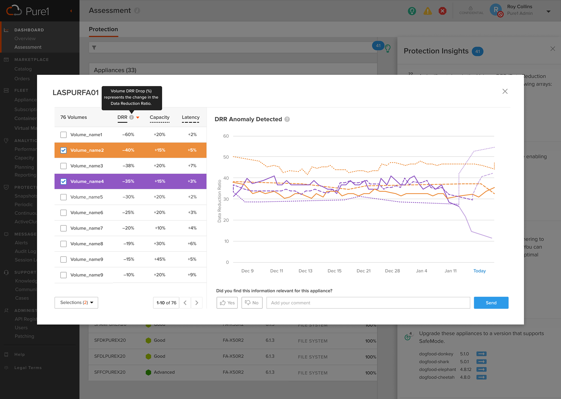
DRR Anomaly Detection
In Data Protection section, users needed to track anomalies in Data Reduction Ratio (DRR). Drops in DRR were critical signals of misconfiguration, inefficiency, or potential risks, but users lacked a clear visualization and alert mechanism.
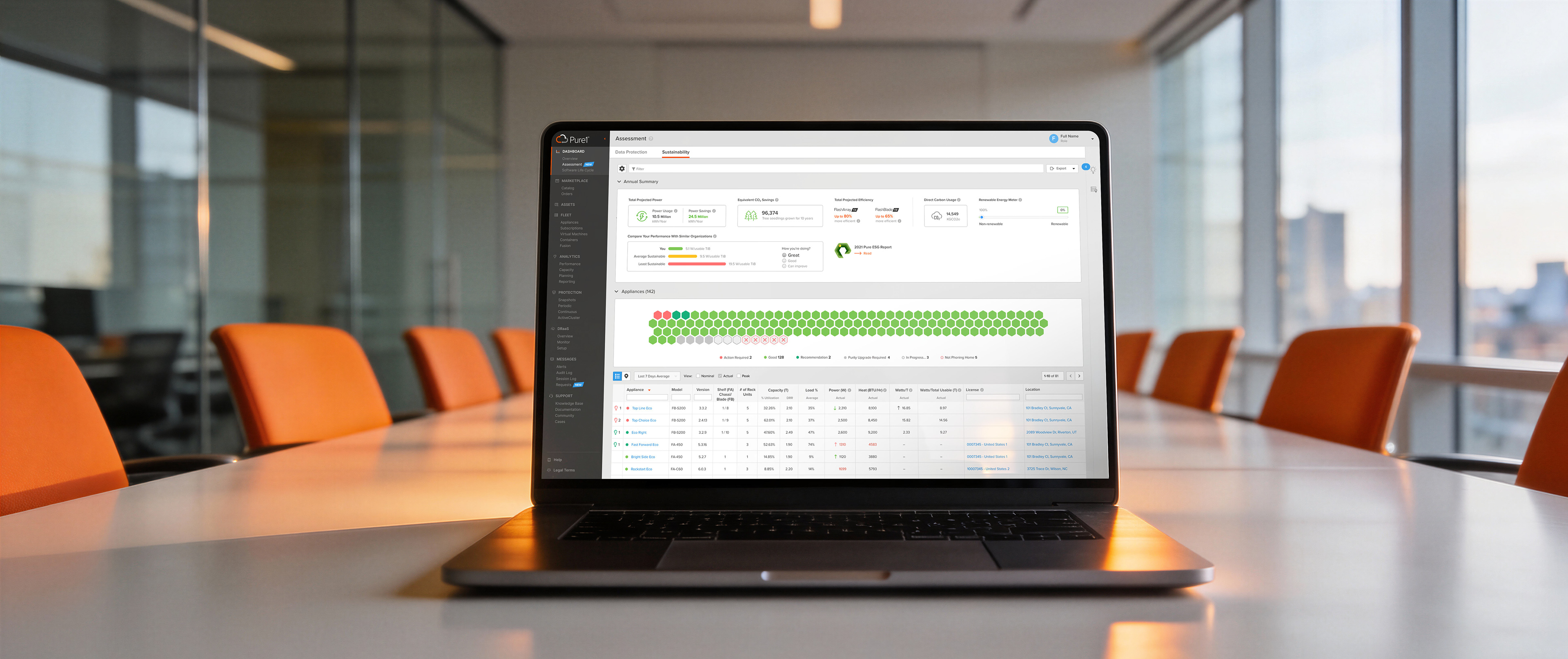
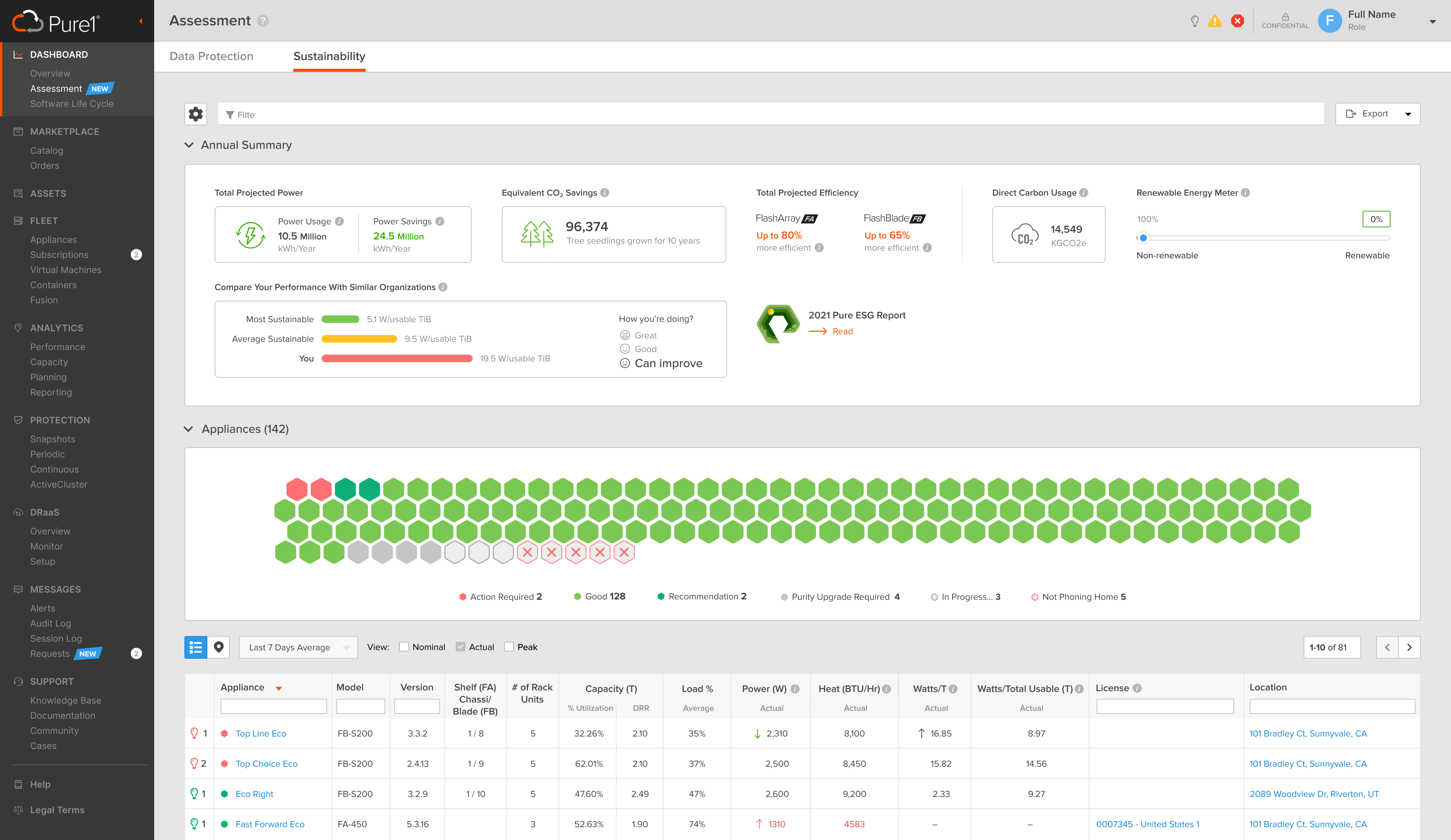
Sustainability Dashboard
Inside the Assessment > Sustainability section, users also lacked a clear visualization.
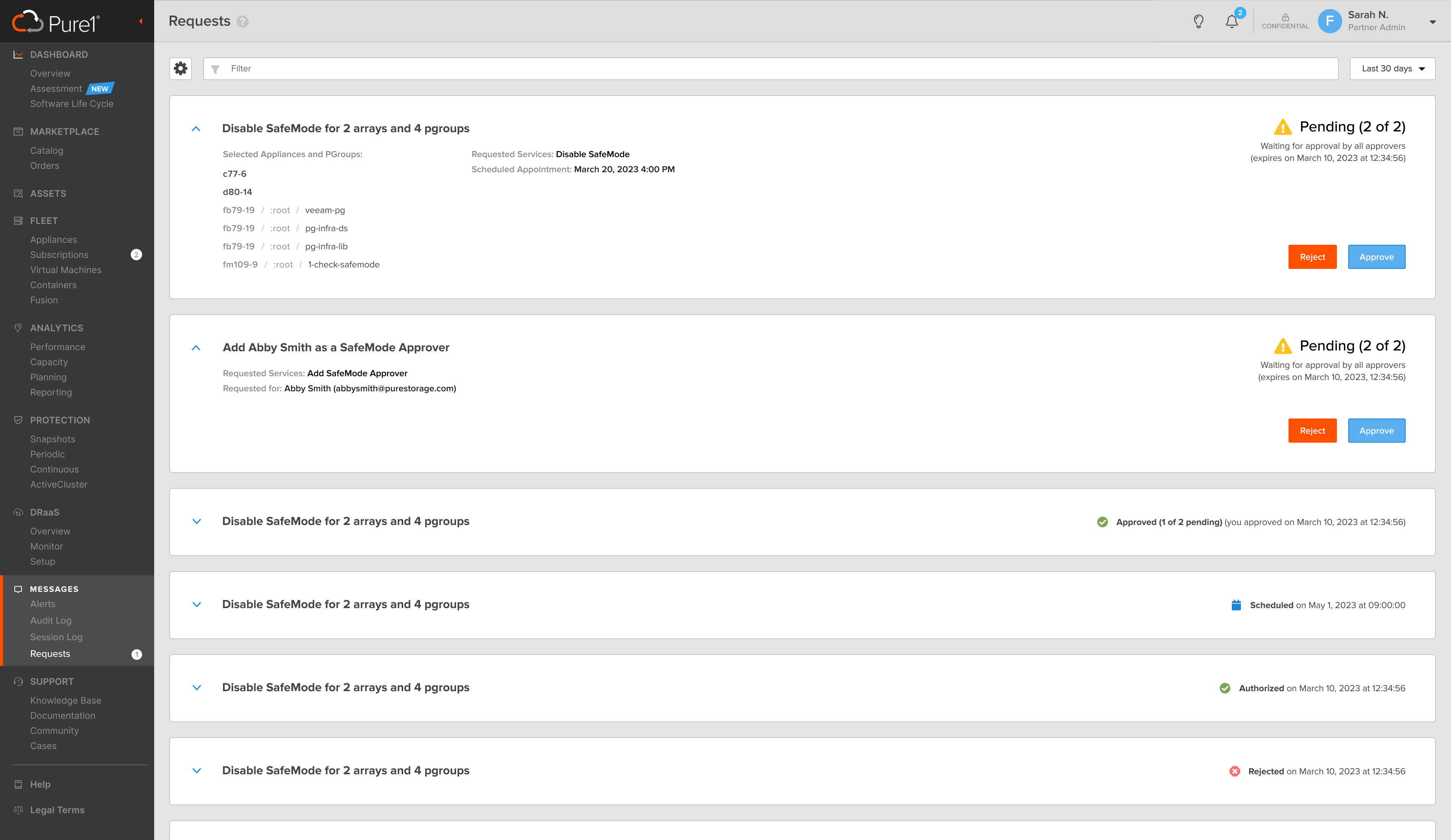
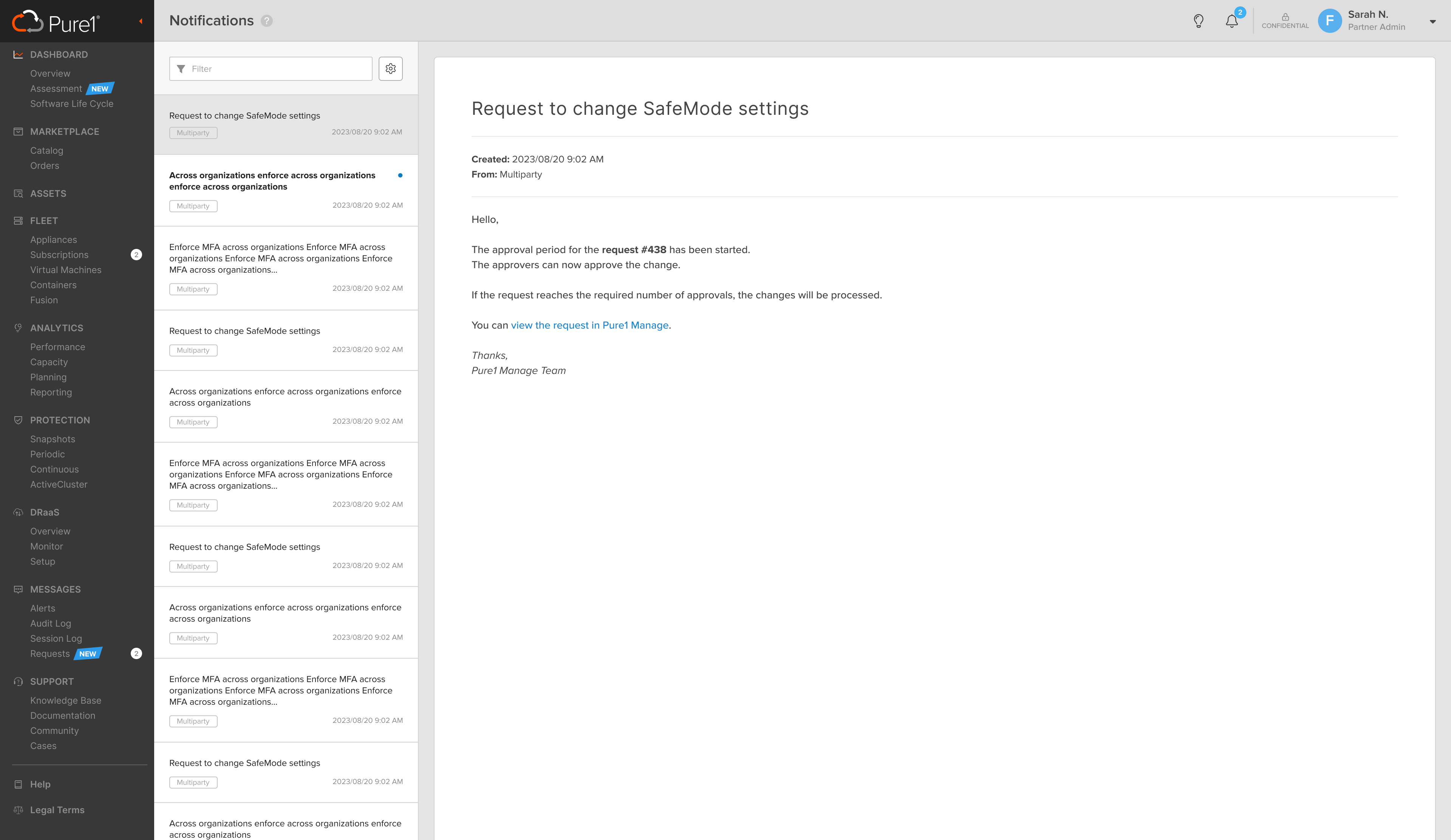
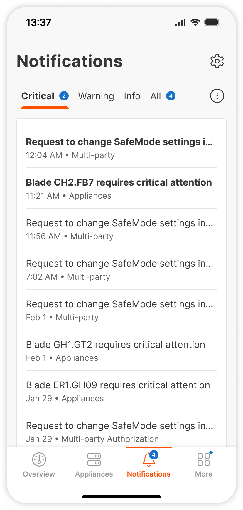
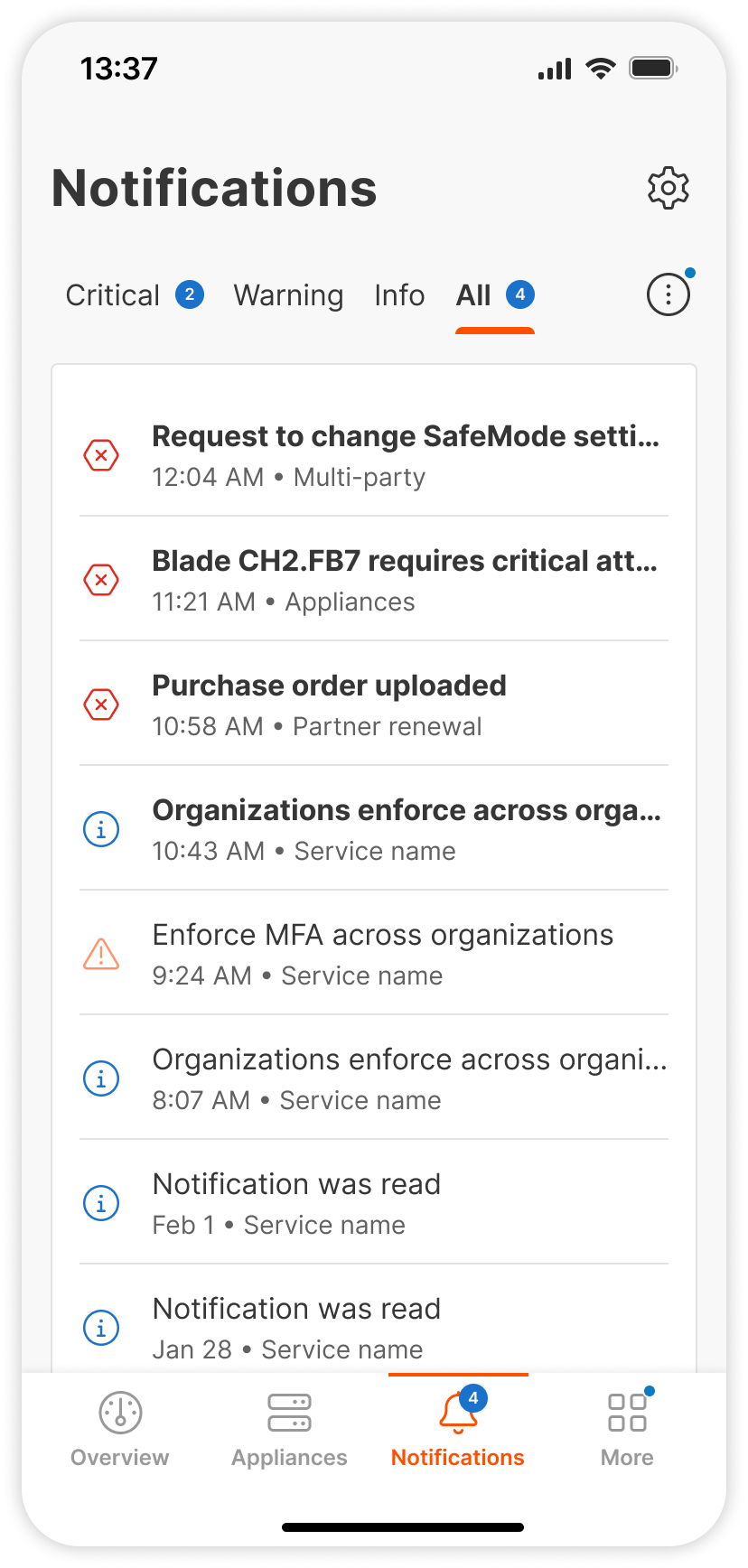
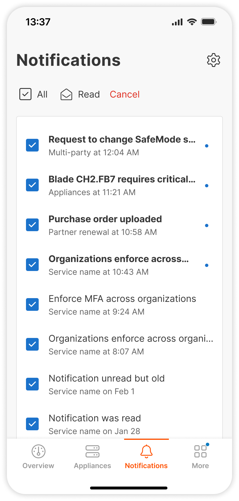
Notification Center
Previous system of notifications was unstructured, unprioritized, and did not leverage the new design system, so the users could not easily notice and respond to important updates.
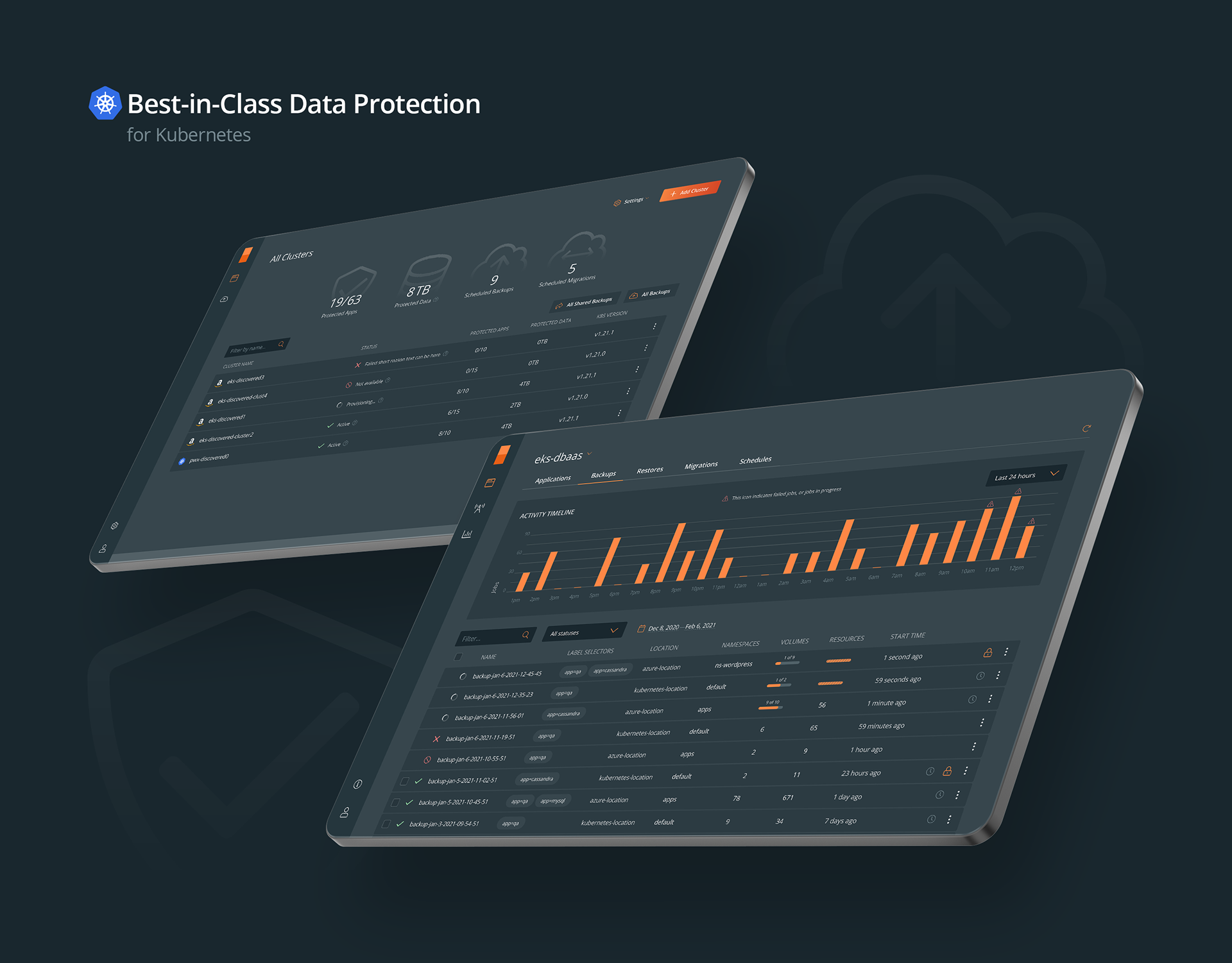
Audit Center
Users needed one, centralized spot to look into, filter, and investigate all of the system logs in all of the environments where they could take fast action on insight. The process in place was fragmented, tedious, and often required flipping back and forth in multiple different tools.
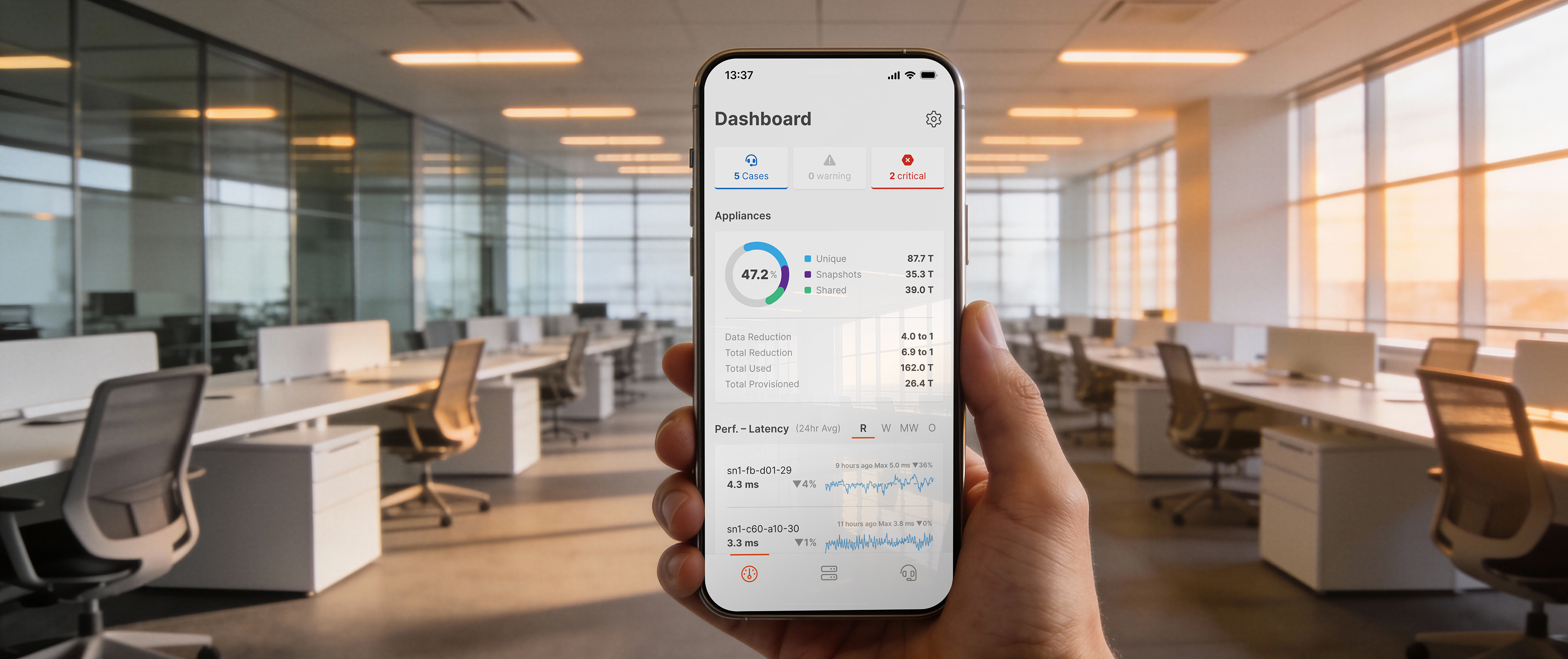
Mobile App
Previous UI lacked consistency, usability and compatibility with the new company design system.
Hypothesis
“
By redesigning such features in research-informed user-centered design, we can cut support workload substantially, increase awareness of data resilience, and facilitate more mobile engagement.”
My role
Cross-functional Collaboration
Partnered with PMs on the roadmap and synced daily with engineers to make sure everything we built was actually doable.
User Insights
Ran interviews to get into the users' heads and turned their feedback into clear design directions.
Visual & UX Design
Crafted everything from quick low-fidelity sketches to polished, pixel-perfect high-fidelity mockups.
Interactive Prototyping
Built functional prototypes to test ideas early and ensure a smooth hand-off to the development team.
How I came to proposed solutions
User Discovery
Conducted user interviews to uncover pain points.
Concept Validation
Created low-fidelity prototypes to validate initial concepts.
Iterative Testing
Iterated through usability testing and cross-functional reviews.
Final Handoff
Delivered high-fidelity mockups aligned with the company’s new design system.
Tech Stack: Figma, FigJam, Miro, Balsamiq, Slack, Jira, etc; and internal analytics.
The Results
Enhanced SafeMode
Data Resiliency Score Dashboard
DRR Anomaly Detection
Sustainability Dashboard
Notification Center
Pure1 Mobile App
I contributed as the Design Lead, collaborating with an external design agency. I ensured a consistent look and feel by applying our new design system and delivered a series of screens and functionalities — including the Notification Center, a scalable menu system, and final mockups for the development team.
How my solutions helped
Enhanced SafeMode
Reduced request turnaround from ~1 month to <1 week; eliminated the need for scheduled support calls.
Data Resiliency Score Dashboard
Encouraged customers to assess and improve their data protection strategies, leading to higher adoption of add-on services.
Notification Center
Consolidated alerts and updates into one easy-to-access feed, reducing missed critical events and improving response times.
Audit Center
Provided a single, powerful interface to search, filter, and analyze all logs in real time, enabling quicker troubleshooting and proactive maintenance.
Mobile App Redesign
Increased downloads and engagement among both new and existing users, ensuring a consistent cross-platform experience.
Challenges I faced
Balancing usability and safety for SafeMode workflows. Presenting complex resilience metrics in a way that was both accurate and easy to digest. Balancing consistency of the brand against platform-specific UI constraints of the mobile app.
Impact
Users
Enhanced productivity, quicker access to main actions, enhanced data health awareness.
Business
Lowered support burden, more opportunities for upsell, improved user interaction.
Results
4 times faster SafeMode switch requests
25% more engaged mobile app users after redesign
Purchasing extra services related to the new Resiliency Score dashboard feature
What I have learned
User workflows should be validated early through direct user involvement. Improvements in workflow speed can have a massive impact on customer satisfaction and internal efficiency levels. Consistency in design systems across web and mobile drastically reduces cognitive load for users.
Big thanks
To Daniel Hailemariam (Head of UX & Product Design), Payal Srivastava (Product Leader), Sandeep Phadke (Director of Product Management), Lana Gletski (Senior UX Designer), and many other amazing colleagues who supported me with early brainstorming, design validation sessions, user testing, and research activities.
References
Marketing page: purestorage.com/products/aiops/pure1.html
iOS app: apps.apple.com/us/app/pure-1/id1080806440
Android app: google.com/store/apps/details?id=com.purestorage.pure1
iOS app: apps.apple.com/us/app/pure-1/id1080806440
Android app: google.com/store/apps/details?id=com.purestorage.pure1
Summary
Type of work: UX Research, SaaS Design, Mobile App Design
Team: Pure Storage, R&D in Prague, Czechia
Date: January 2022—September 2024
Team: Pure Storage, R&D in Prague, Czechia
Date: January 2022—September 2024