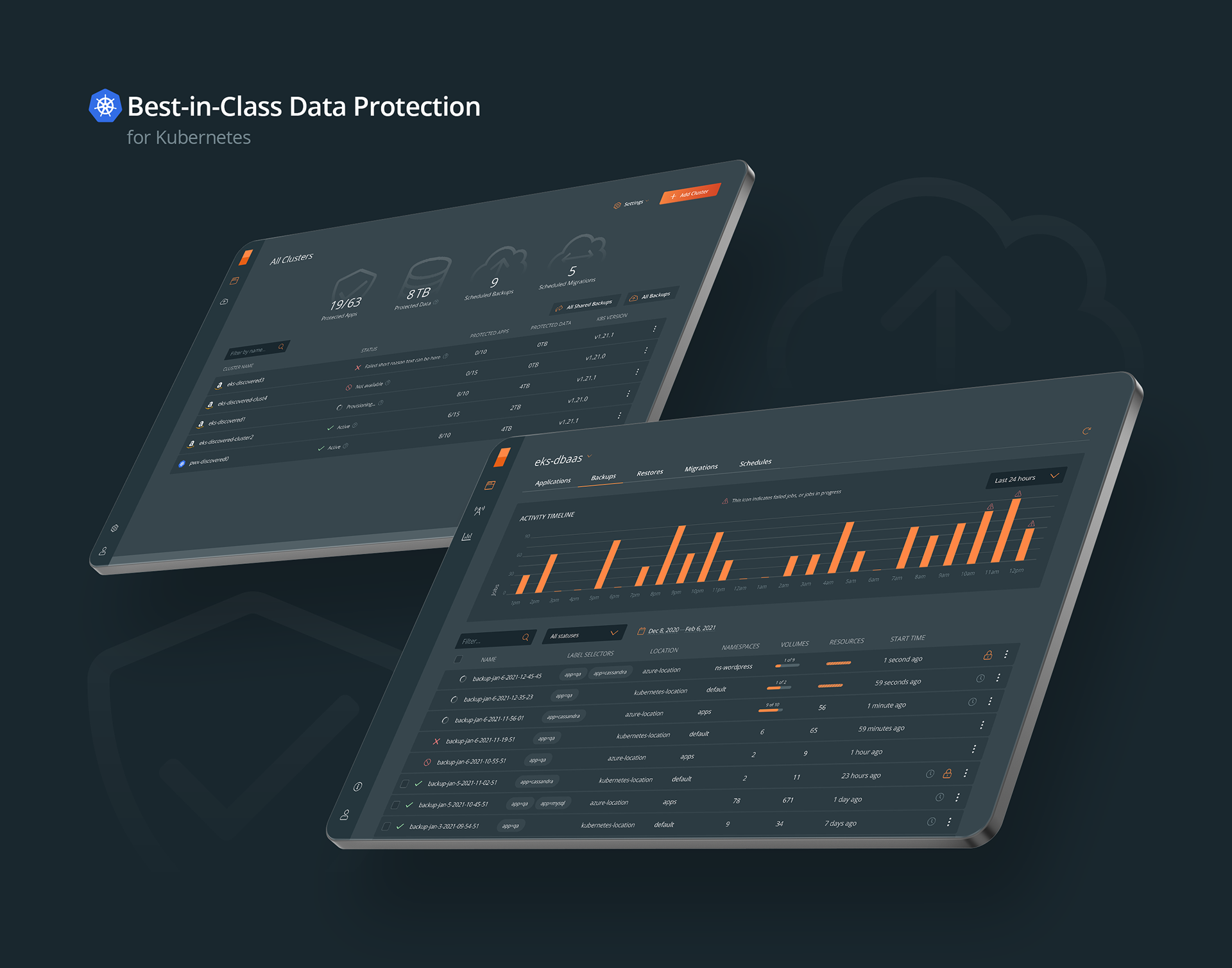
Best-in-Class Data Protection for Kubernetes
Backup-as-a-Service (real name and logo is under NDA) is built for Kubernetes, simplifying compliance and data protection. Self-service management empowers application owners to backup and restore their apps anywhere in just a few clicks.
Kubernetes applications are very different from traditional applications. They’re made up of many parts—containers, pods, volumes, configuration—deployed at much higher densities, and updated much more frequently. As a result, storage optimized for traditional applications does not work well for Kubernetes.
The problem
When I joined the team, I was the first and only staff product designer. The team had only static mockups for major pages. There was no research at all: no personas defined, no user journeys, no application structure diagrams. So, I was excited to start basically everything from scratch.

One of the most visited screens ↑
My first goal was to transition the existing screens from static PNG files to Figma while addressing obvious visual and usability issues. I aimed to understand and improve user flows, optimize the application structure and information architecture, ensure consistency in UI and copy, and create a basic UI kit and library for the front-end team, along with an interactive prototype featuring basic flows and interactions together with animations.
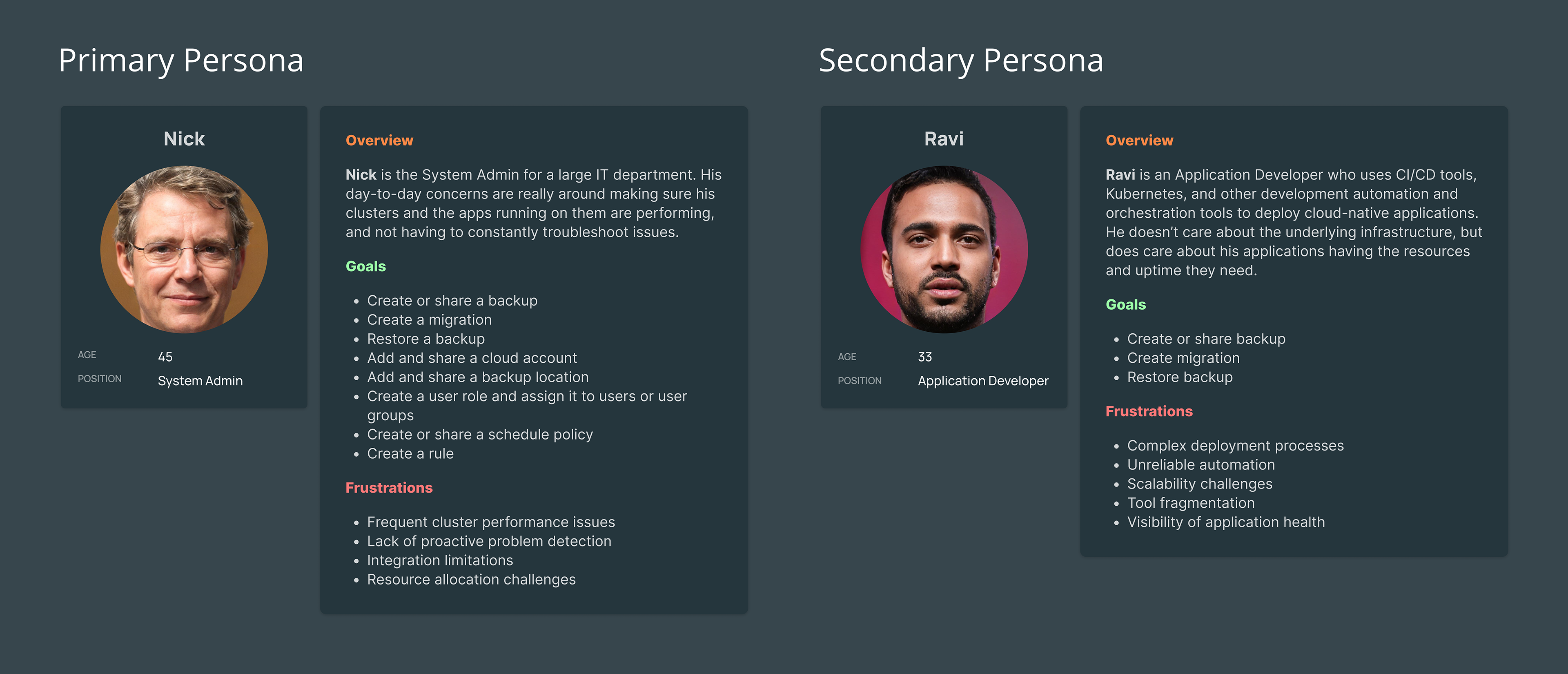
Product's presonas ↑
My specific role in the project
I was responsible for all of Backup’s product design—as the sole designer during the first year. Later, another 2 designers joined us and helped me with additional products developed under the startup’s umbrella.
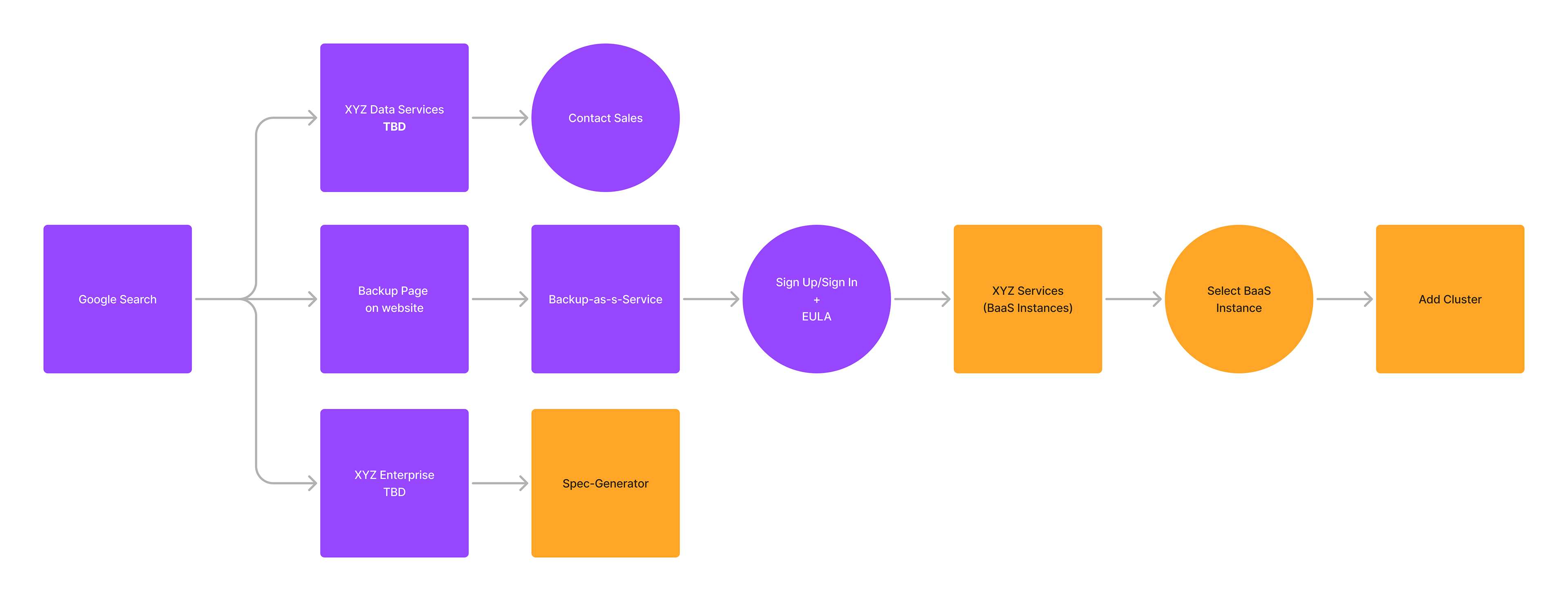
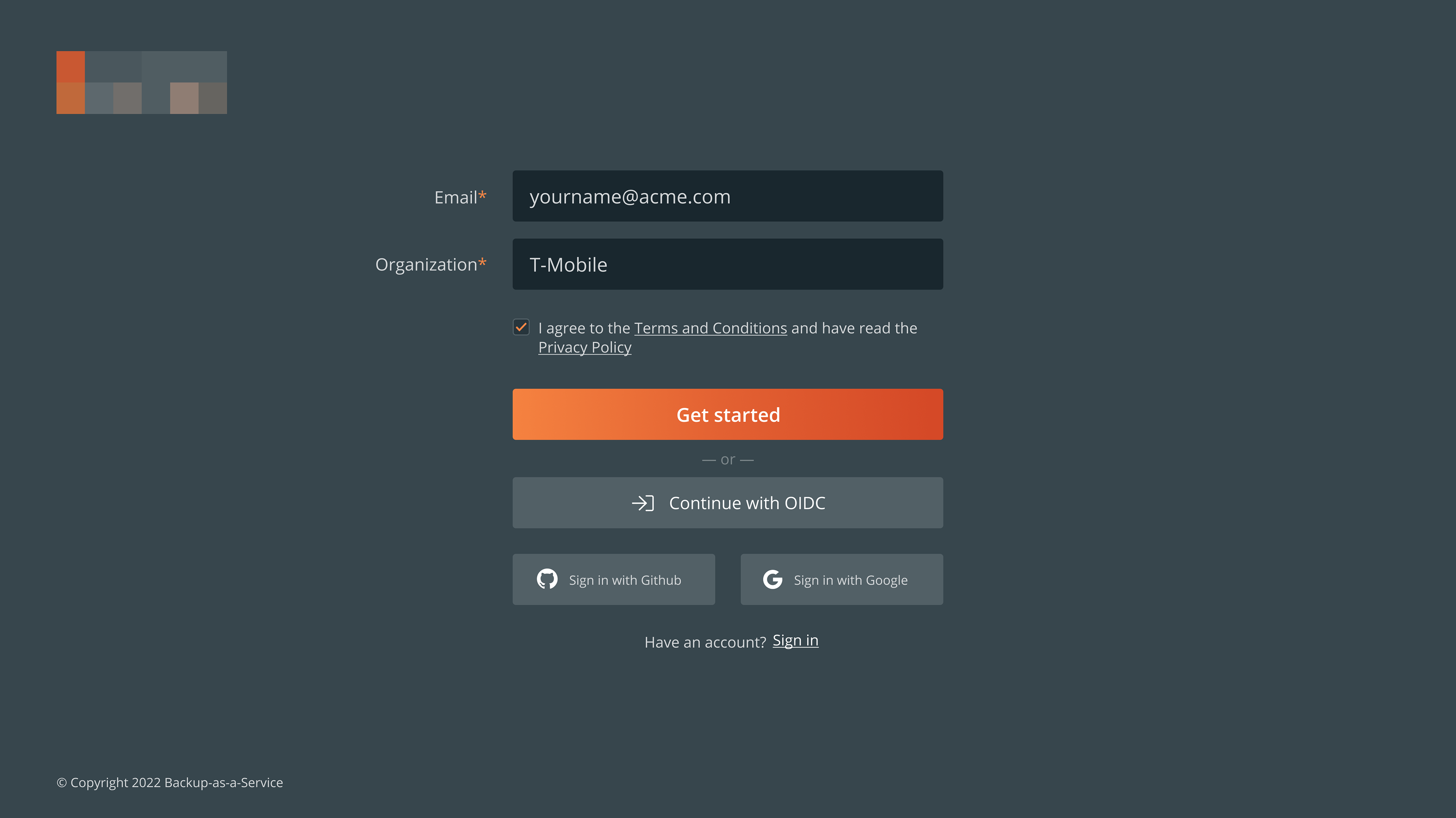
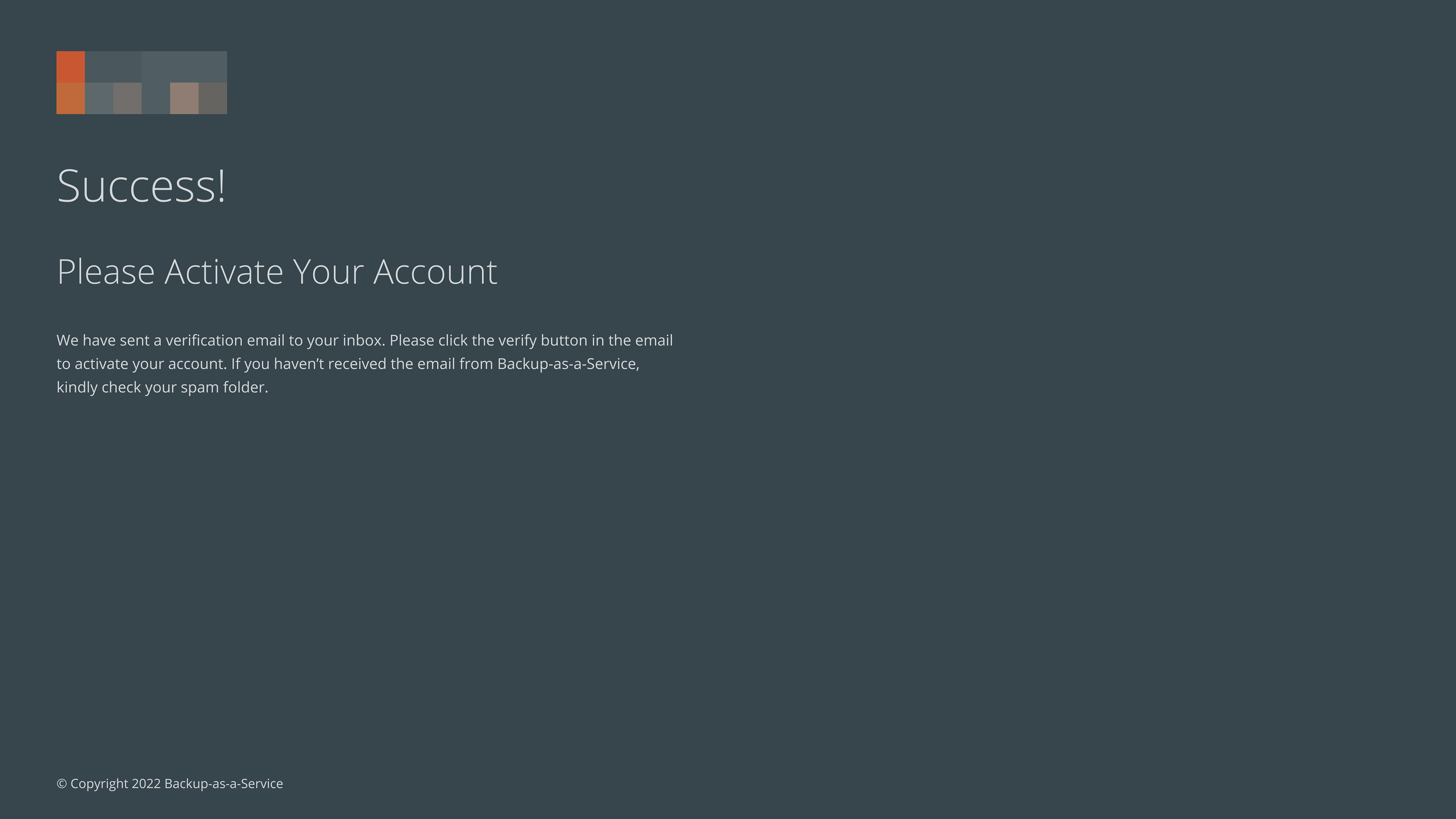
Simplified version of user onboarding with backend change and demo cluster creation ↑
One of my most valuable contributions was redesigning the registration and onboarding flow. I worked to simplify the registration and trial sign-up processes, reducing the number of steps and introducing a smoother, more intuitive experience. This included integrating cluster discovery to help users find relevant features faster, making the onboarding process more efficient and user-friendly.


How I came to my proposed solution
To arrive at my proposed solution, including the high-fidelity prototypes, I carefully considered several factors. I chose to maintain an overall styling theme with a dark background and orange as an accent color. While I recognized that this choice might not be ideal for accessibility—since orange is less accessible on light backgrounds—I made this decision based on our current plans. Since we did not anticipate developing a light version in the near future, I decided that the dark and orange accent theme would be the most effective for our users under the present circumstances.


My initial mockups in the first iteration ↑
How my solution solved the problem
My solution addressed several key issues and significantly improved the user experience. By re-creating the existing screens and focusing on fixing obvious usability problems, users can now navigate the application more intuitively and efficiently. The redesigned user flows streamline tasks, reducing confusion and frustration.
The optimization and enhancement of the application structure and information architecture make it easier for users to find and interact with the information they need. The consistent UI and copy ensure a cohesive experience across the application, eliminating inconsistencies that previously disrupted usability.
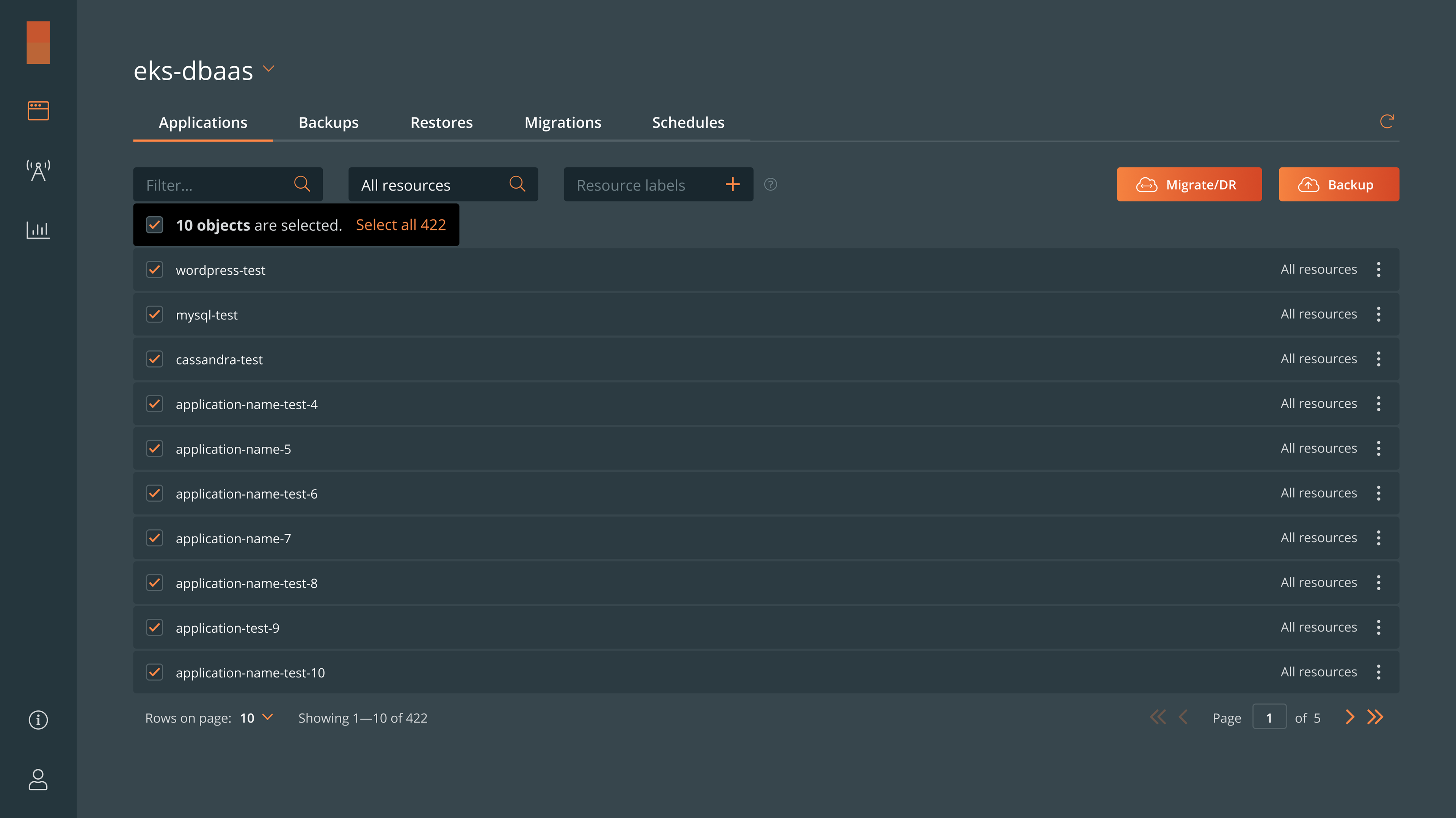
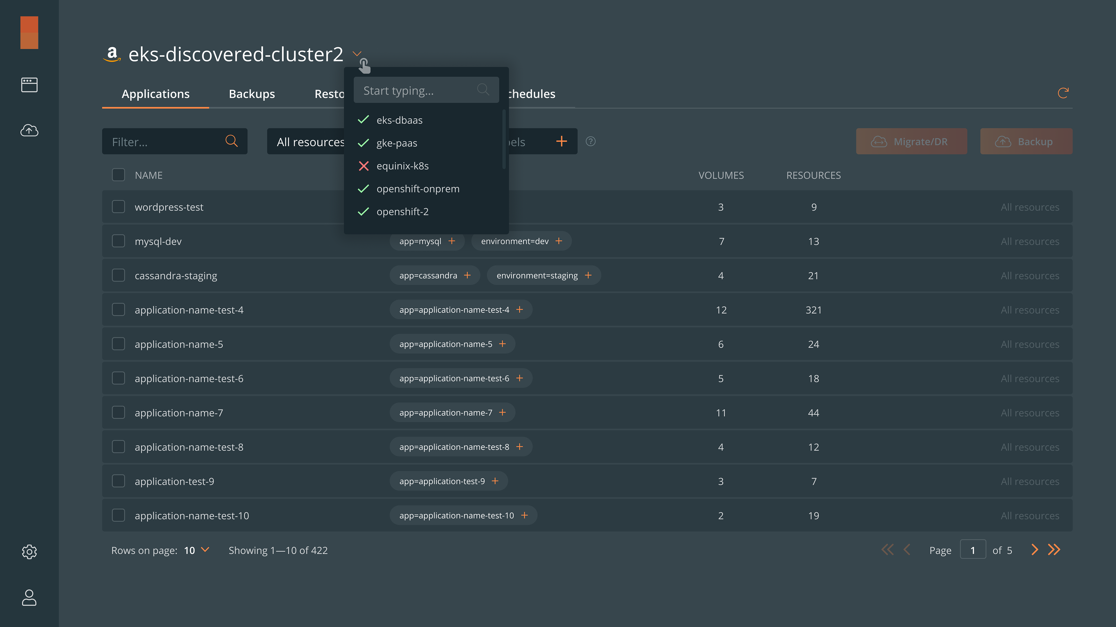
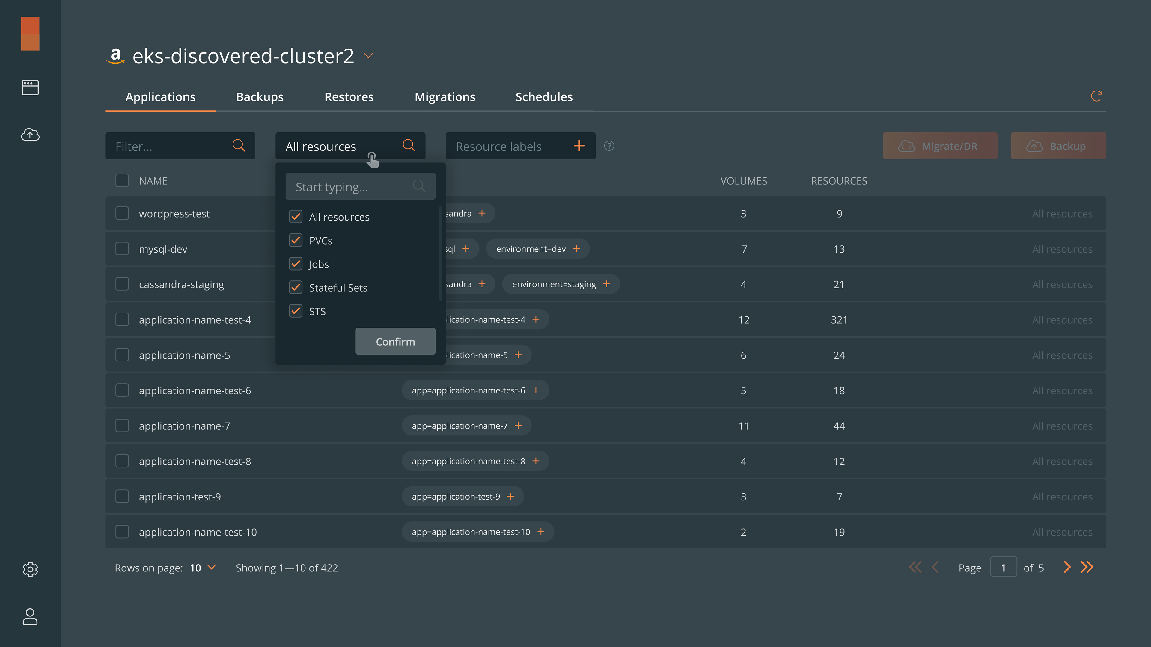

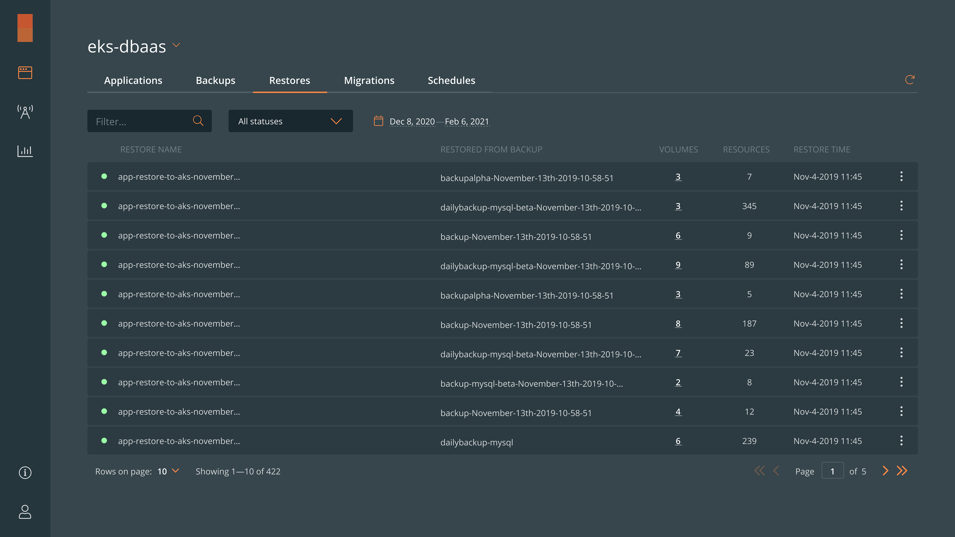
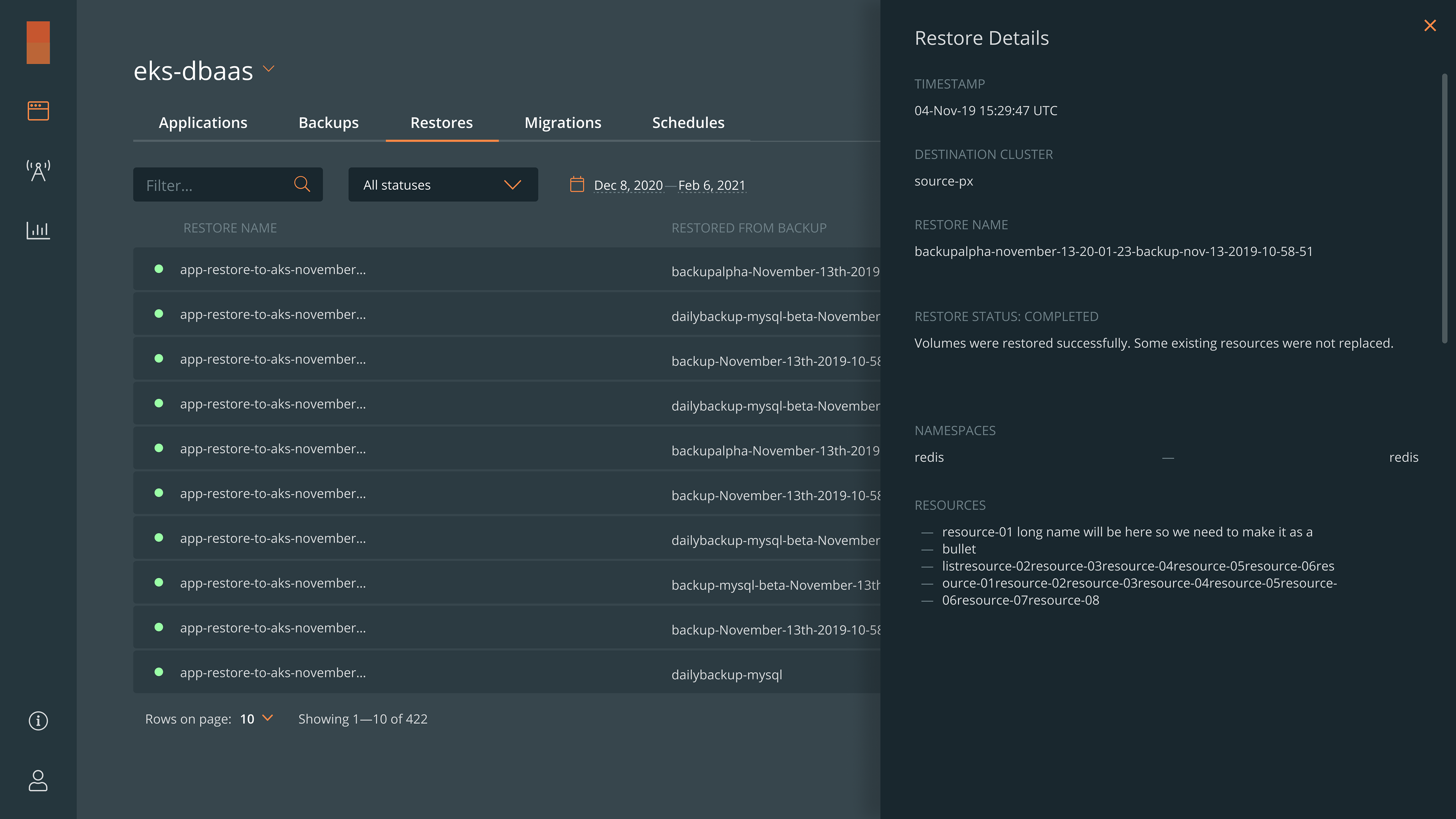
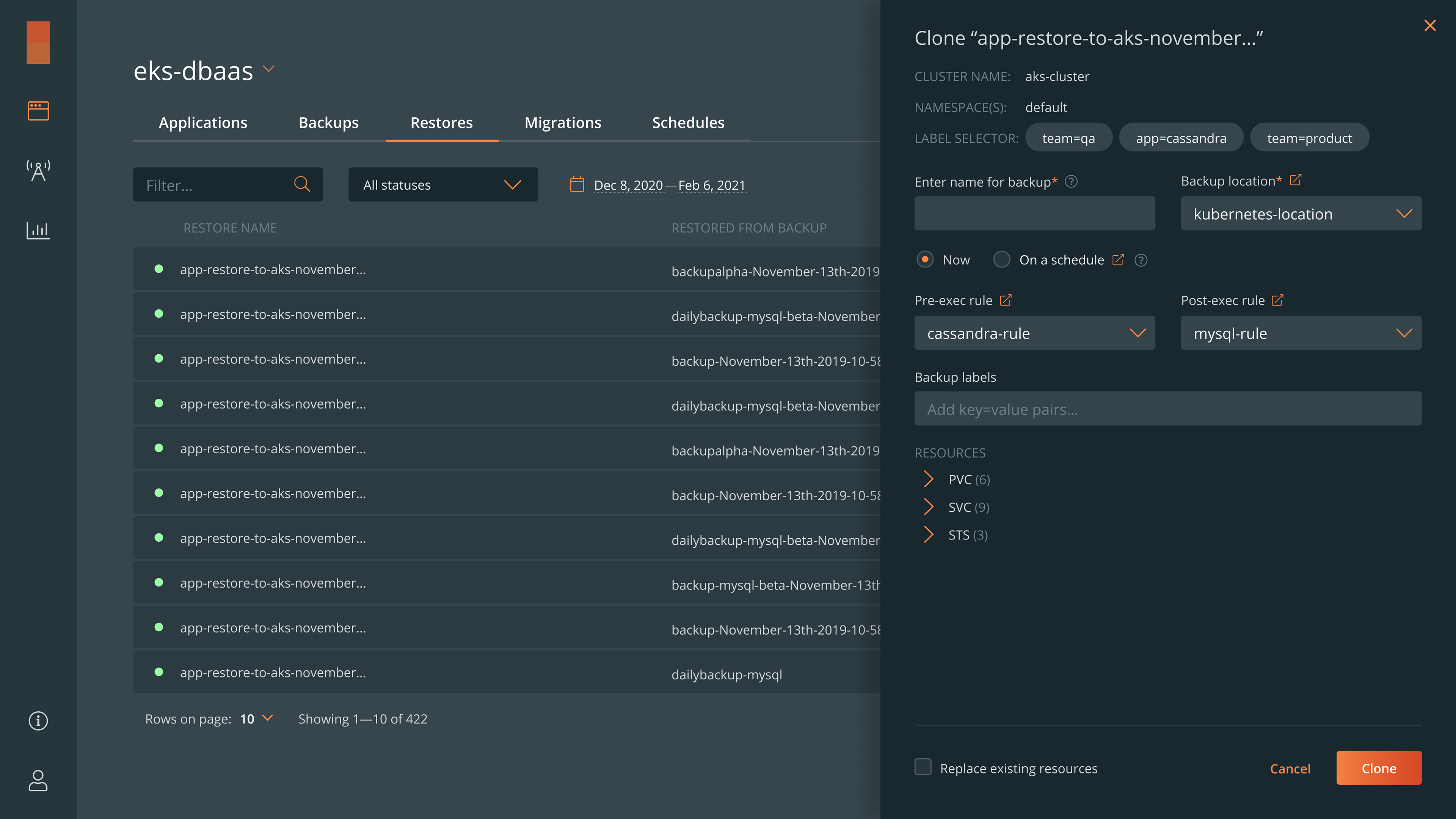
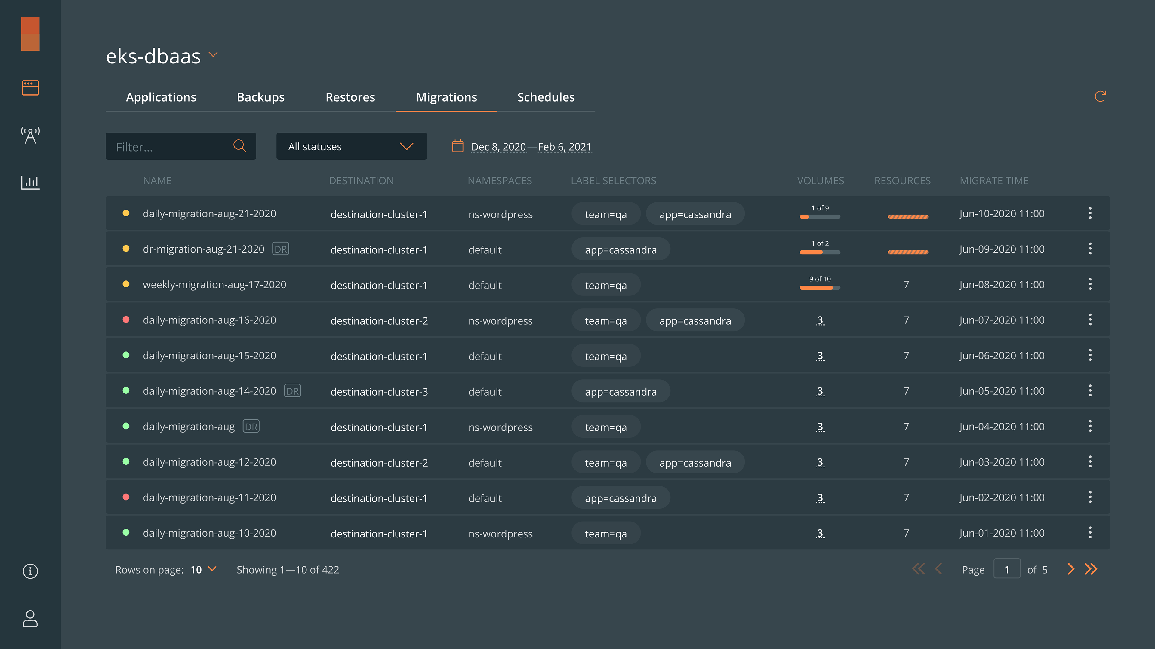
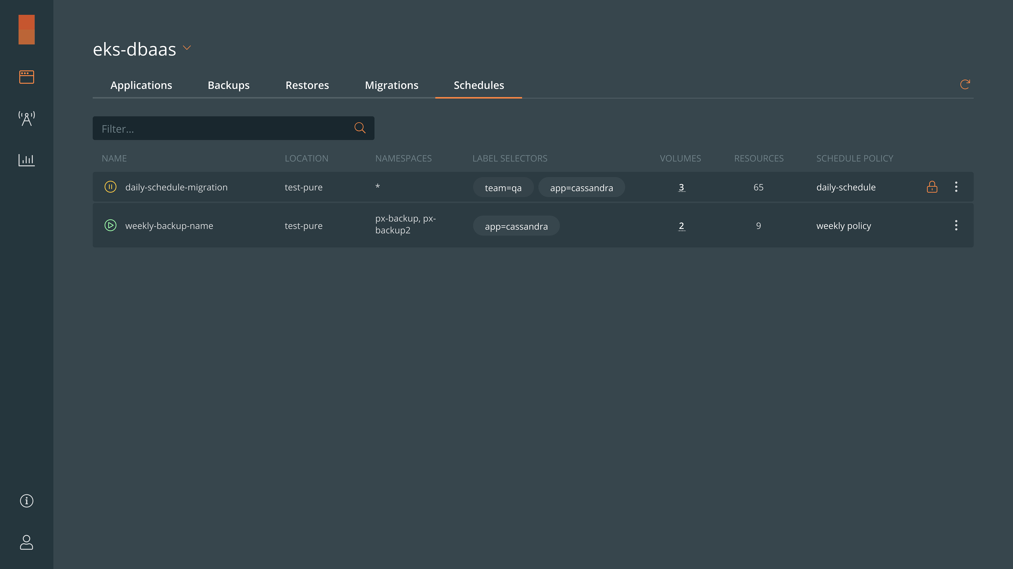
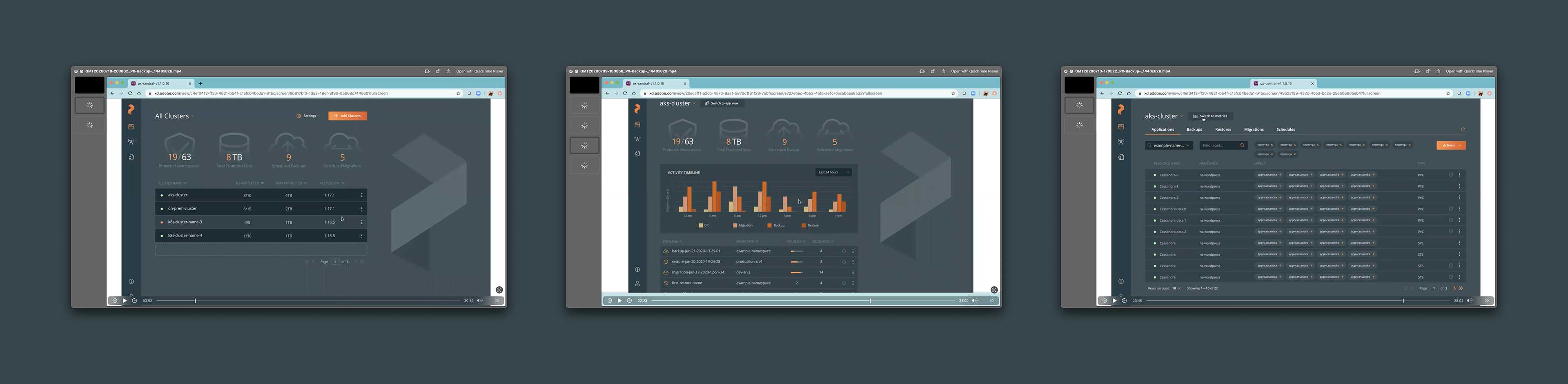
The most visited screens: Applications, Backups, Restores, Migrations, and Schedules ↑
Additionally, the creation of a basic UI kit and library for the front-end team has established a standardized design framework, enabling faster and more consistent development of new features.
Overall, users now benefit from a more accessible and well-organized interface, which simplifies their daily interactions with the application and improves their overall productivity. This solution resolves previous limitations and provides a more seamless and enjoyable user experience.

Challenges I faced
Initially, the team had only basic mockups, with no defined roadmap or clear understanding of the features needed for our end-users. This lack of foundational information made it challenging for me to fully understand the current state of the application and to propose valuable improvements.
To navigate these challenges, I collaborated closely with the product management team. Together, we iteratively created interactive prototypes and conducted usability testing sessions with customers who were willing to engage in this process.
We used various design concepts, sketches, and journey maps to refine our approach. Photos from workshops and whiteboard sessions were instrumental in visualizing and discussing potential solutions. Through this iterative process, we defined user flows, gained insights into our customers' needs and common use cases, and successfully released a new MVP. This allowed us to align development efforts with user expectations and continue progressing in the right direction.
User roles assignment user flow ↑
How the project affected users and the business
The project had a significant positive impact on both users and the business. By addressing usability issues and optimizing the application’s structure, we saw a marked increase in user satisfaction and engagement. After implementing the new design, user satisfaction scores improved by 24%, reflecting a more intuitive and consistent user experience.
The streamlined user flows and enhanced information architecture led to a 32% reduction in task completion time, allowing users to perform their daily activities more efficiently. This improvement was particularly appreciated by our customers, as it directly translated into increased productivity.
On the business side, the release of the new MVP resulted in a 21% increase in user adoption rates within the first three months. The iterative prototyping and testing process ensured that the product aligned closely with user needs, which in turn reduced churn and boosted customer retention.
Overall, my contributions not only enhanced the user experience but also sped up the startup’s growth by improving key metrics that drive business success.
Recorded usability testing sessions ↑
What I have learned
One of the most valuable lessons I learned was the significance of user-centered design, particularly through the user testing sessions I conducted early on. These sessions were among my first experiences in the startup and proved to be crucial in guiding our design decisions. By directly engaging with users, I was able to gather real-world insights into their needs, pain points, and expectations, which were instrumental in refining our prototypes and iterating on the design.
I also learned how to navigate the challenges of working without a predefined roadmap or comprehensive research. This required me to be resourceful and collaborative, leveraging workshops, sketches, and journey maps to align the team around a shared vision. Through this process, I discovered the power of iterative design—how constant feedback and adjustment can lead to a product that truly resonates with its users.
Additionally, my experience with creating a UI kit and design library underscored the importance of consistency in design. Establishing a standardized framework not only streamlined development but also ensured a cohesive user experience, which is critical for both usability and brand integrity.
In summary, this project has taught me the value of a user-first approach, the necessity of adaptability in a startup setting, and the impact of design consistency. These lessons have not only enhanced my skills as a product designer but have also equipped me with strategies to tackle future challenges in any design environment.
Cluster pairing user flow ↑
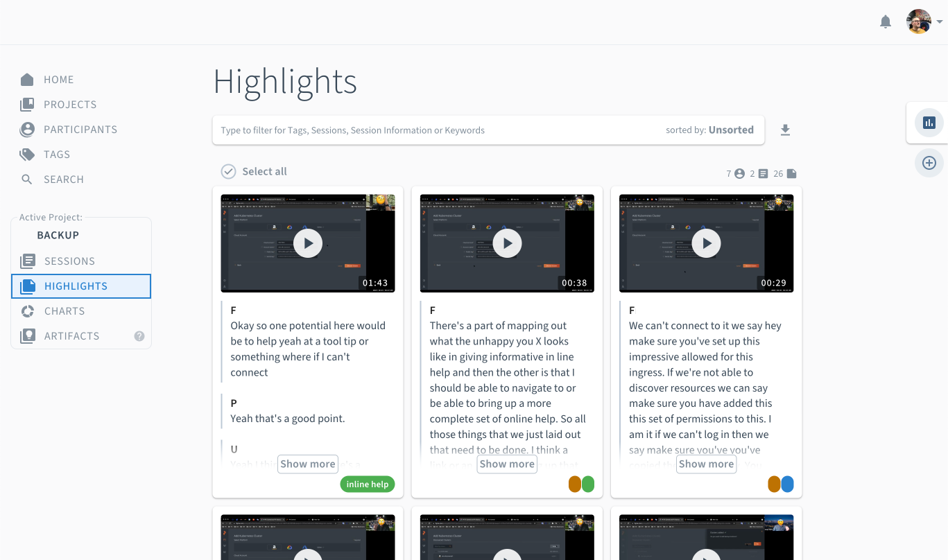

I have used Condens app for my qualitative research activities—such as user interviews and usability testing ↑
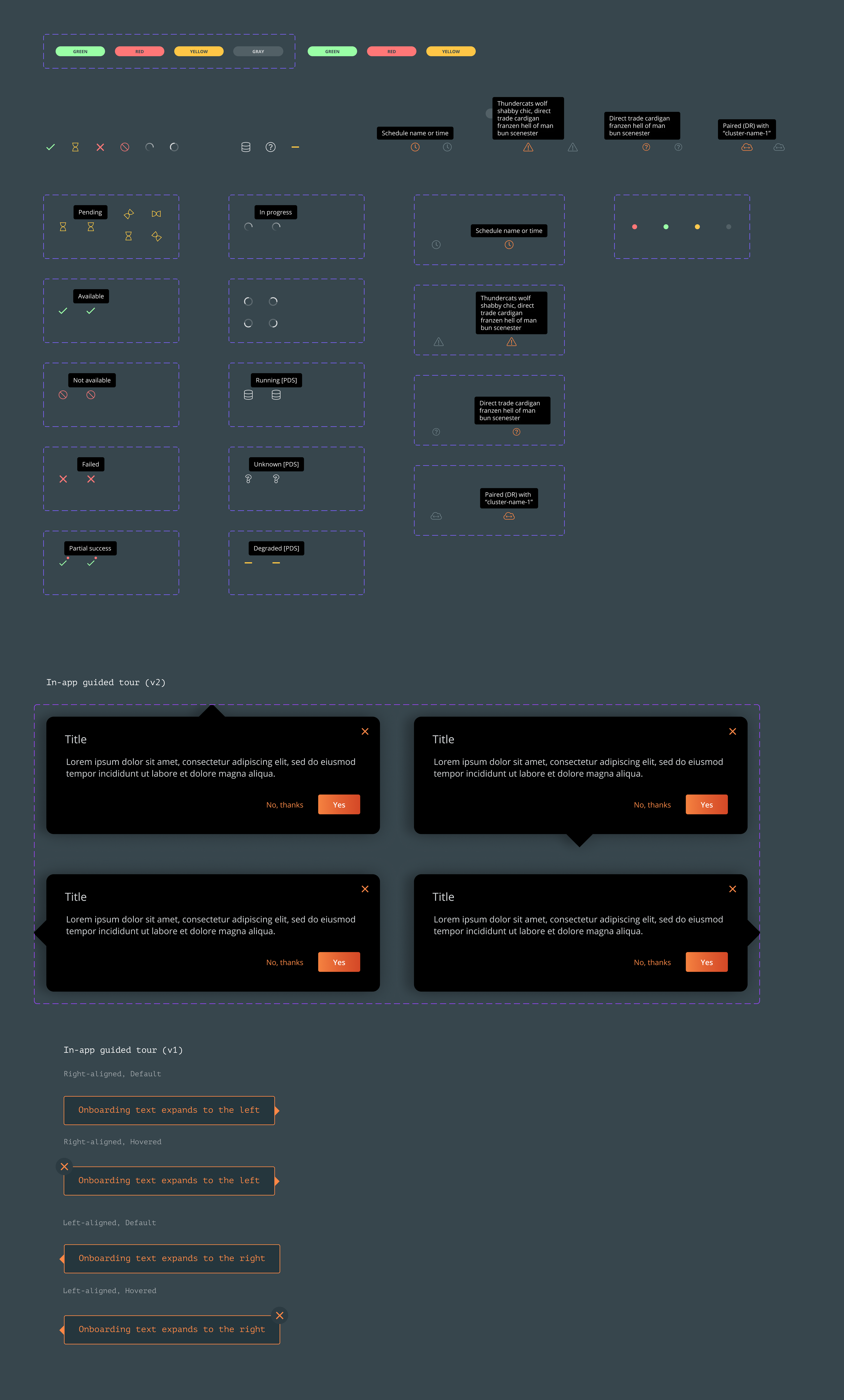
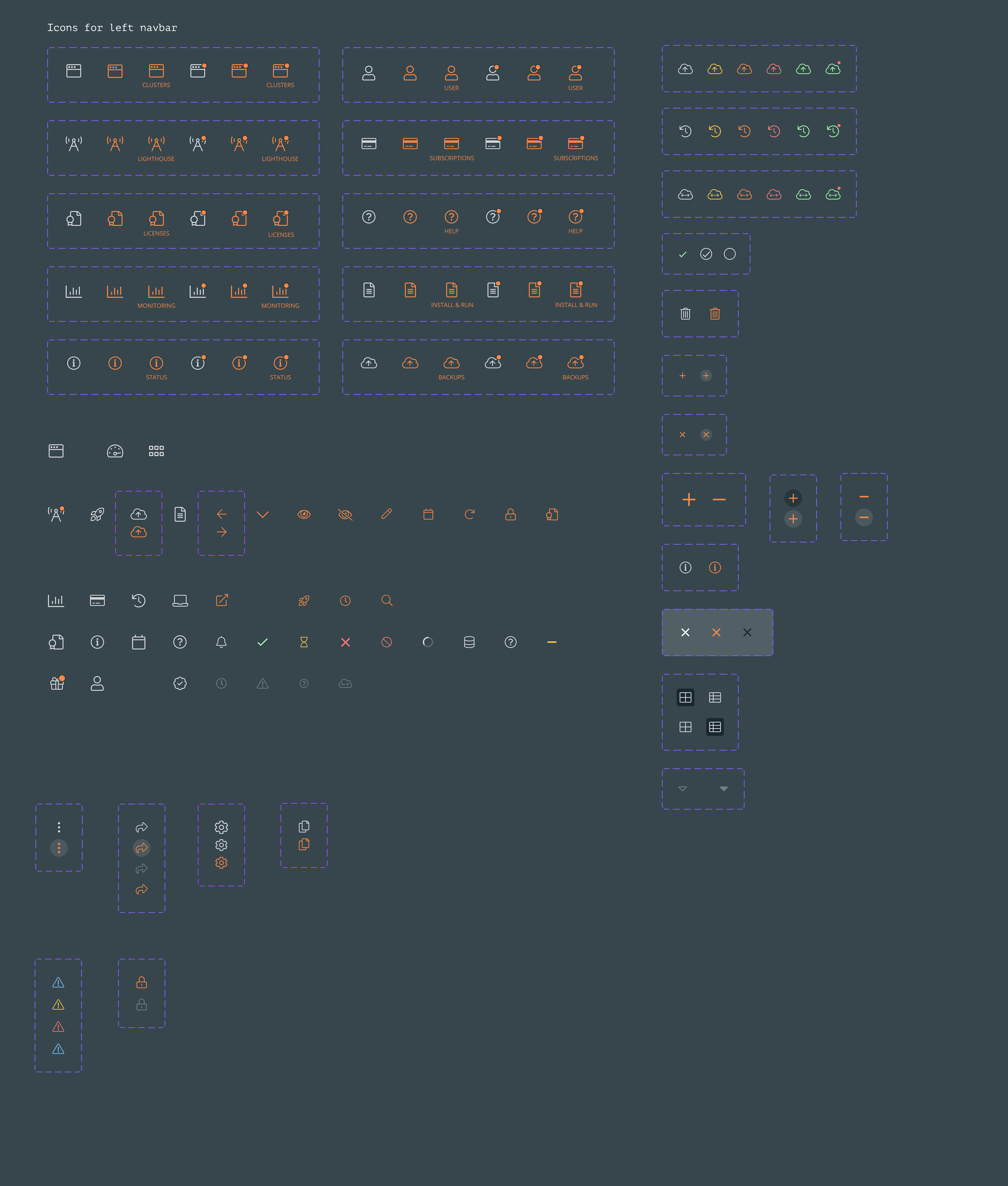
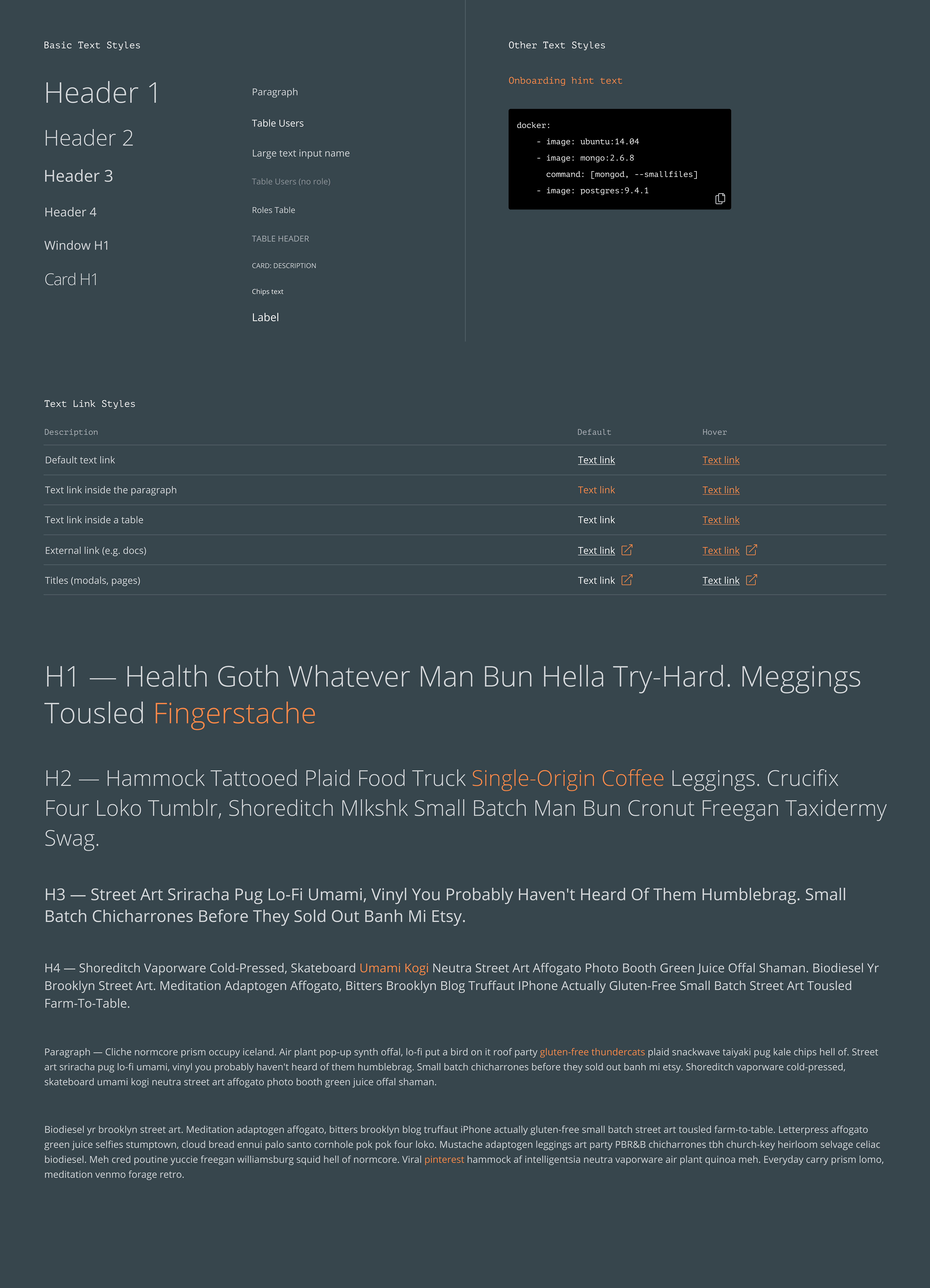
One of many screens from a custom UI Kit I designed ↑
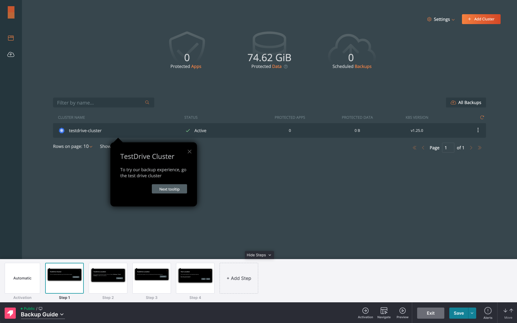
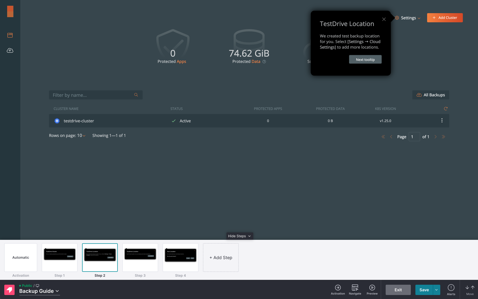
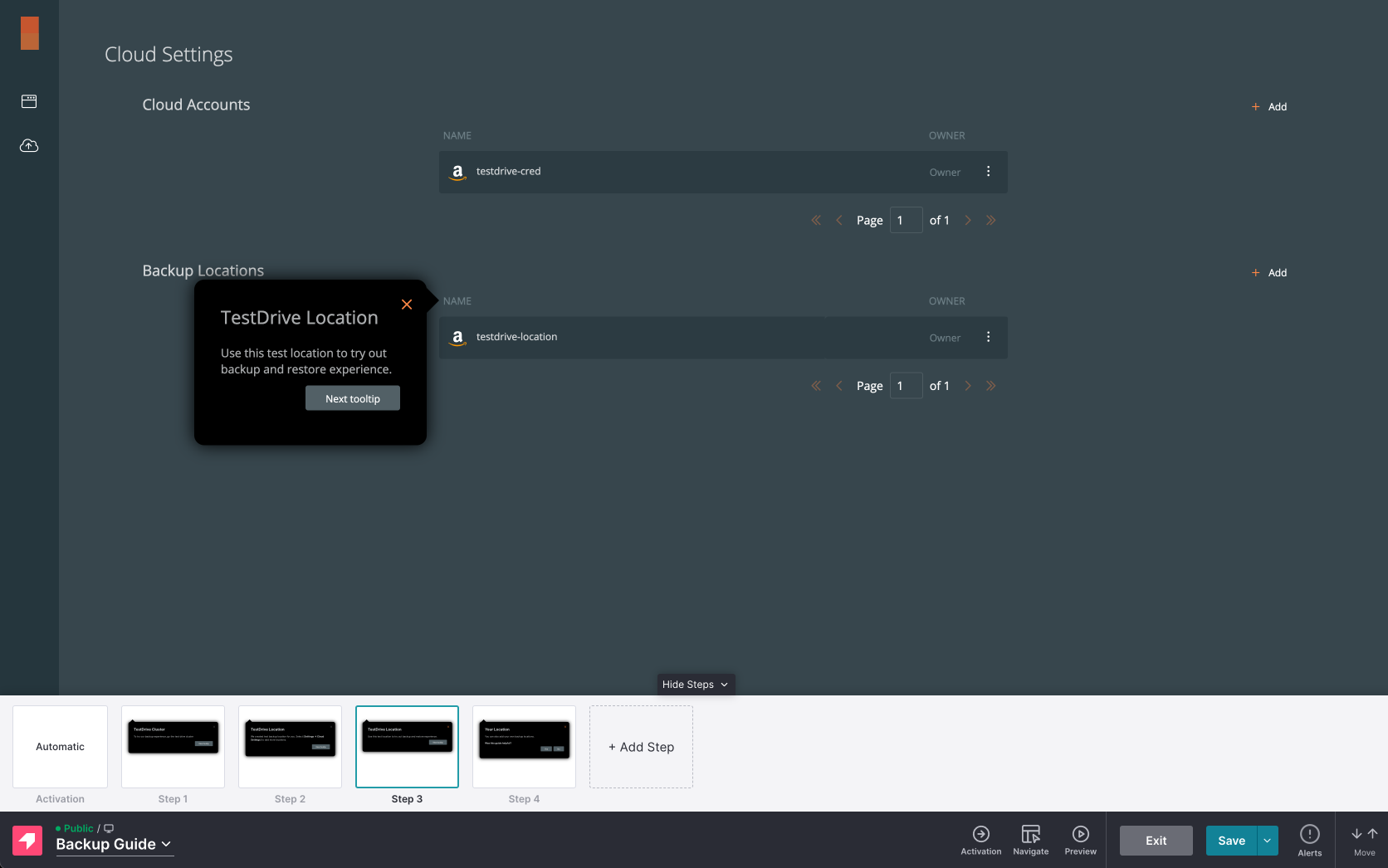
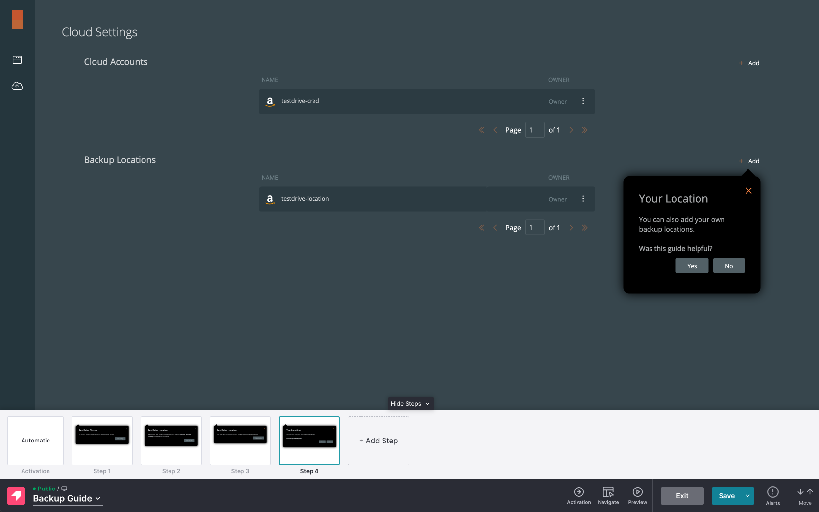
I also integrated Pendo with the tooltips and the Help Center ↑